Dashboard
Updated on 13.11.25
5 minutes to read
Copy link
Overview
The Dashboard is the first screen that you see when logging in to the SEON Admin Panel. This is also your central hub to access all functionalities from the sidebar (check individual walkthroughs for each tab on the dedicated SEON Docs category).
The default widgets you can find here display data in near real-time, so even if you change the state of the transaction after it is sent to SEON, the graphs will be updated to reflect these changes shortly after.
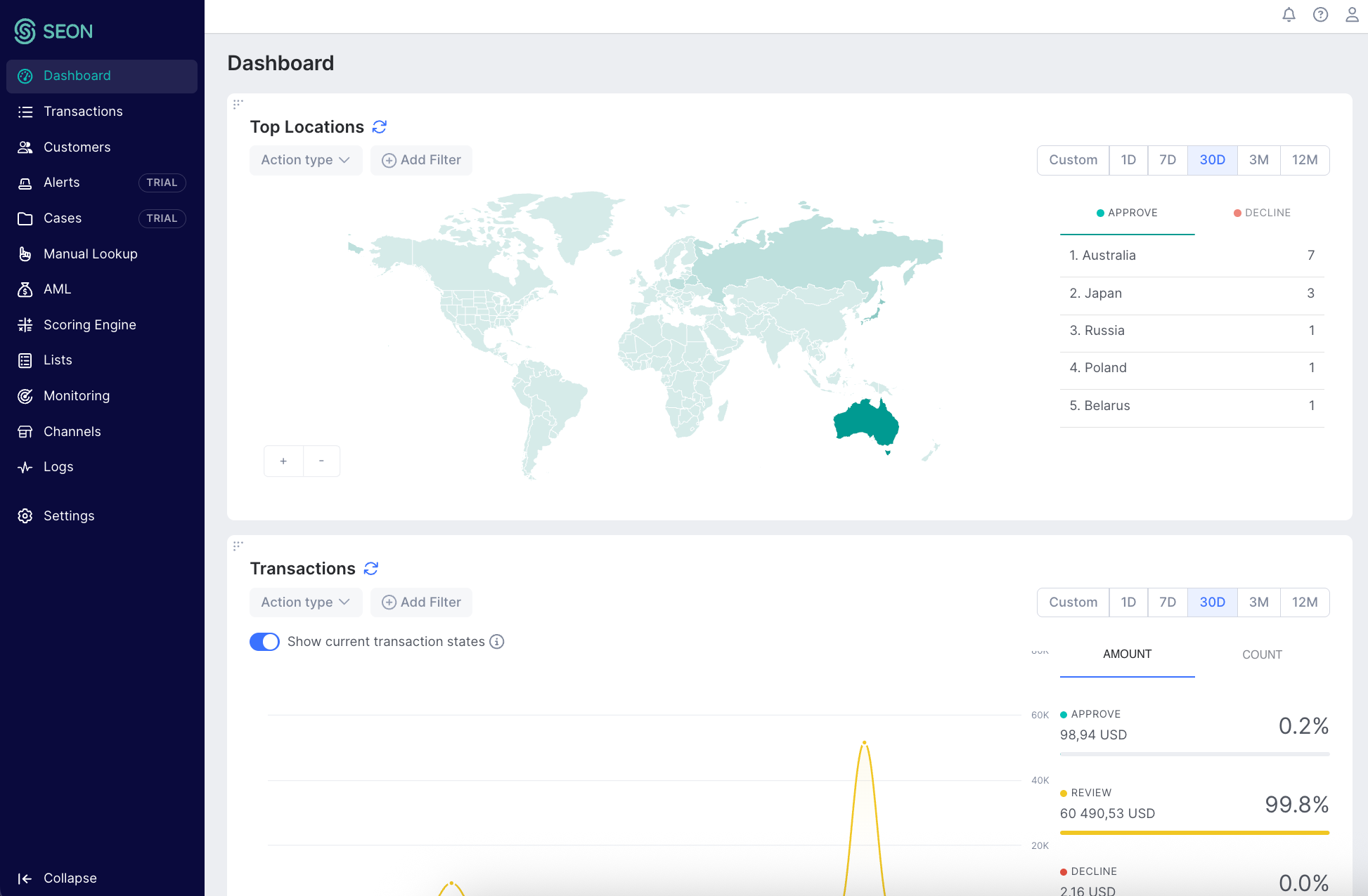
Top transaction locations
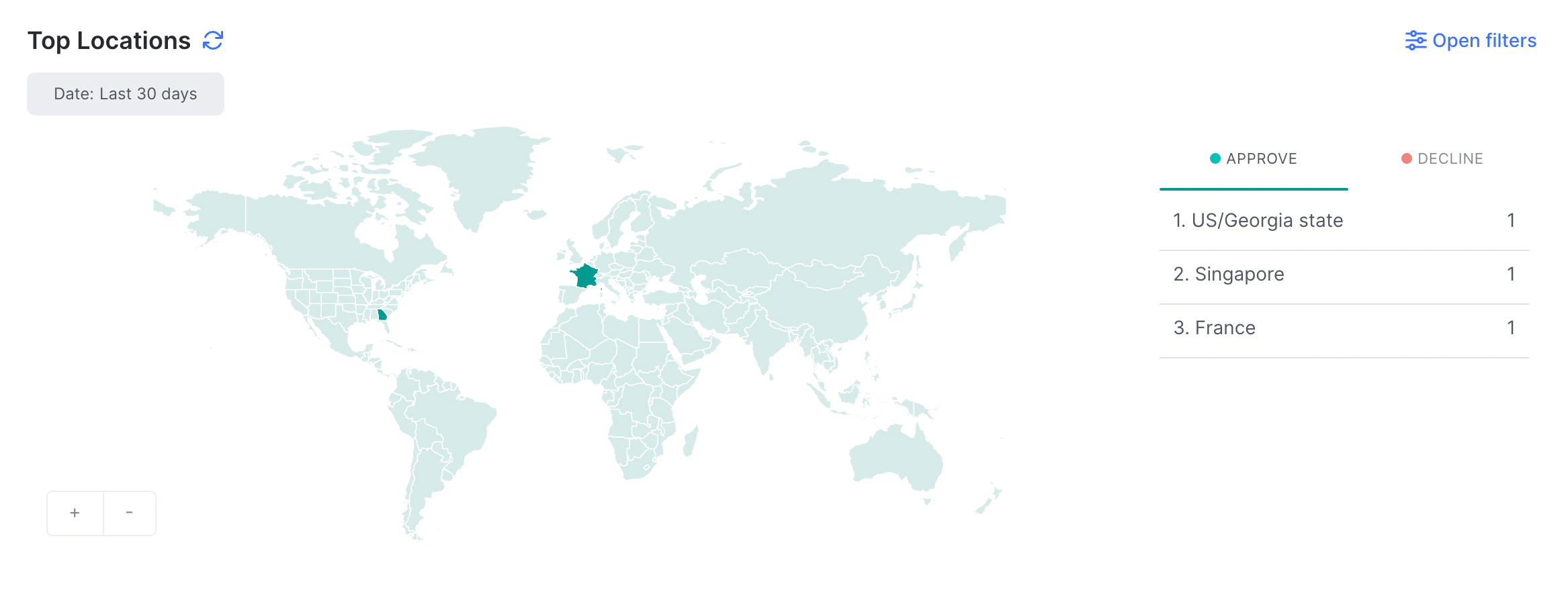
This widget shows countries with the most transactions in APPROVE and DECLINE states over the past year. On the map, you can see fraudulent transactions marked with red and approved transactions marked in green.
You can also zoom in on the map or hover over each country or state to view the number of transactions. The darker areas indicate a higher volume.
Transactions
The SEON Platform uses three states for the classification of transactions: APPROVE, REVIEW, and DECLINE.
This graph shows you how these transaction states compare to each other in real-time so you can discover trends and spikes in suspicious activity.
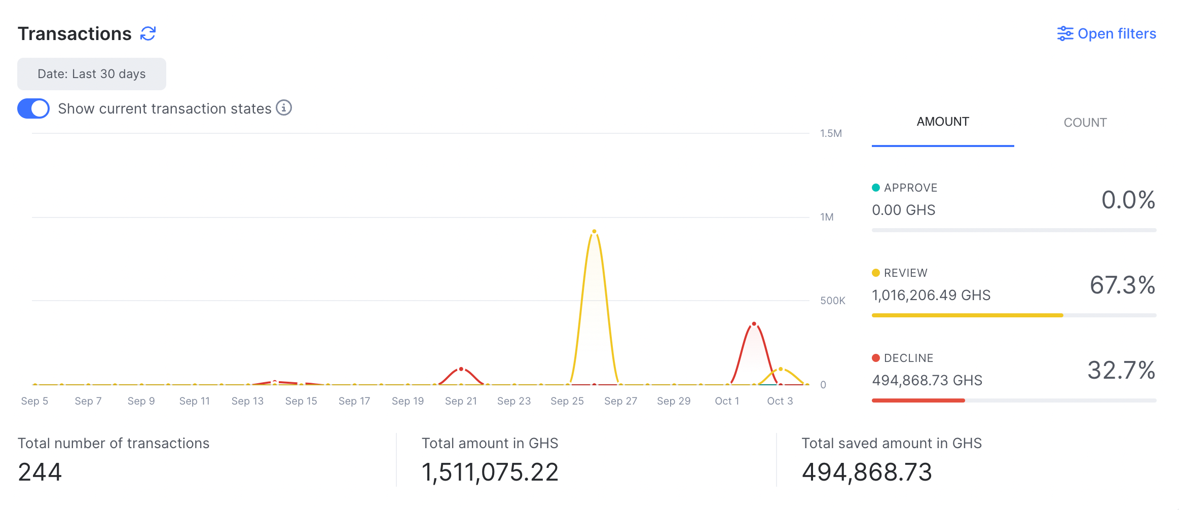
KPIs
Under the graph, we showcase 3 main KPIs that are worth checking out when using SEON.
- Total number of transactions: This metric displays the total number of transactions processed through your account.
- Total amount: This metric displays the total value of all transactions processed through your account. This value is shown in your account's base currency.
- Total Saved Amount: This metric displays the total value of transactions in a DECLINE state — showing you the total amount of revenue you saved by using SEON.
Transaction labels
The Transaction labels widget provides an interactive view of how labels and action types are applied to transactions, helping you track trends, monitor activity and gain detailed insights.
Filtering options
- A filter bar lets you select specific labels by action type to analyze.
- Labels are grouped by sentiment: Negative, Positive and Neutral and action types are organized by different stages of the customer journey
- You can search within the list for quick label and action type selection.
- You can also apply additional filters for payment mode, user country, brand ID, currency, merchant ID, affiliate ID, billing country and shipping country
Selecting or deselecting labels, action types or other filters instantly updates all visualizations, so the Trends, Activity and Insights tabs always stay in sync with your chosen subset.
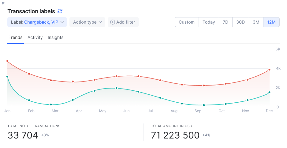
Tabs and visualizations
- Trends: The line chart tracks positive, neutral and negative labels over time and shows totals and transaction amounts for labeled transactions.
- Activity: The stacked bar chart compares labeled vs. unlabeled transactions for each time segment. Includes a summary of current and previous totals.
- Insights: Data grid listing each label by the number of transactions, amounts and percentages of times the label was used compared to all transactions within that time period. It also breaks down data by state and overall share.
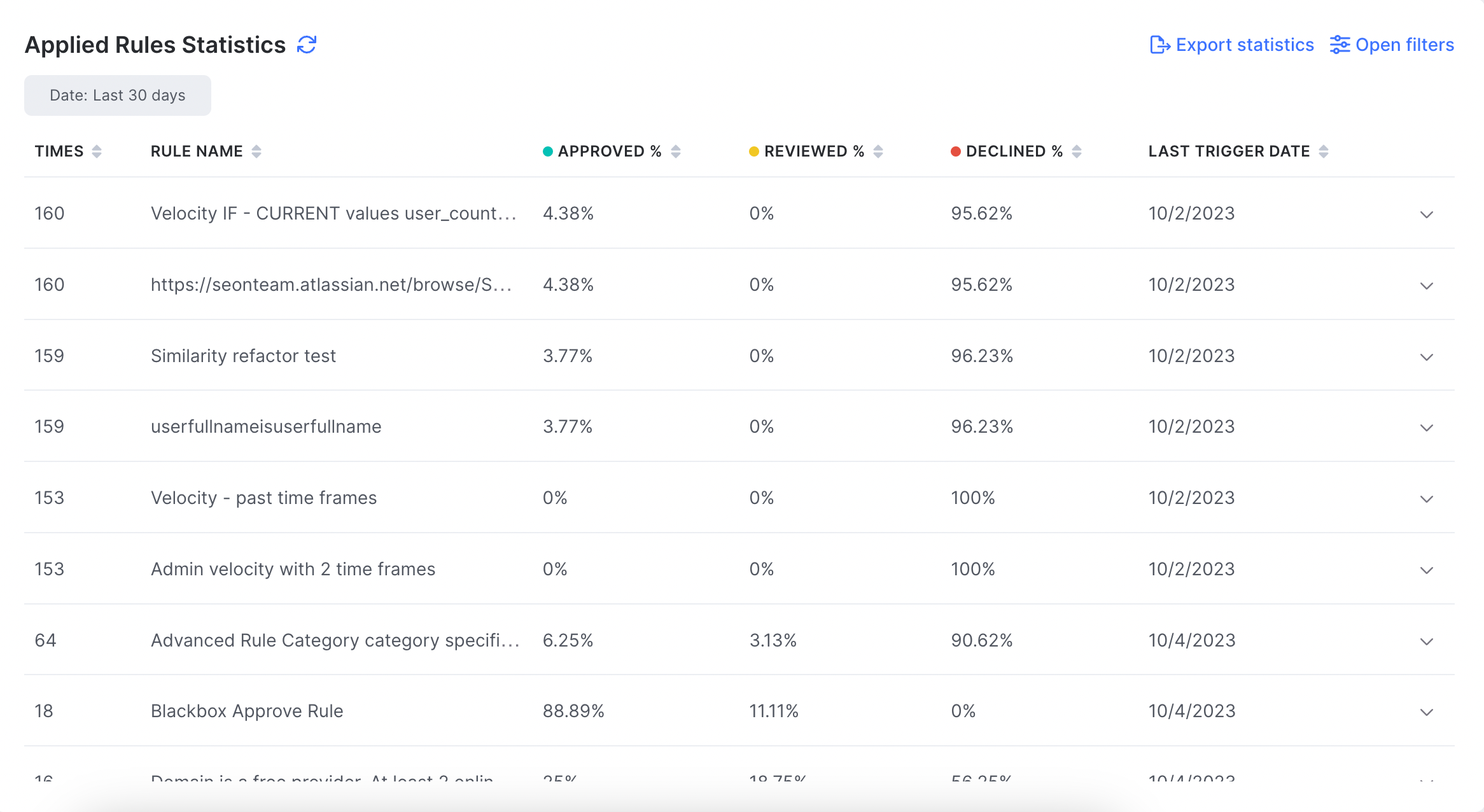
Applied rules statistics
See your most recurring rules and check which ones are triggered the most. Clicking on each rule depicts the data as a graph. This makes it easier for you to see when and how many times a rule was triggered and what states the transactions were placed in. It also gives you quick access to edit that rule.
Choose a label on the right to check the value and volume of transactions you got under that label in the past period.
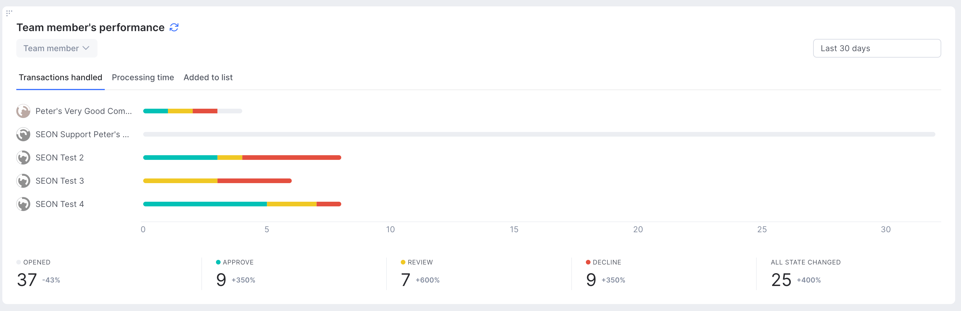
Team member performance
This widget shows the activity of your team members for a given timeframe. You can review statistics for handled transactions (approved, declined, opened), processing time and list activity on separate tabs. This includes the number of declines, approvals and transactions reviewed.
Below, you will find overall statistics for each tab to have an overview of your team's collective activity.
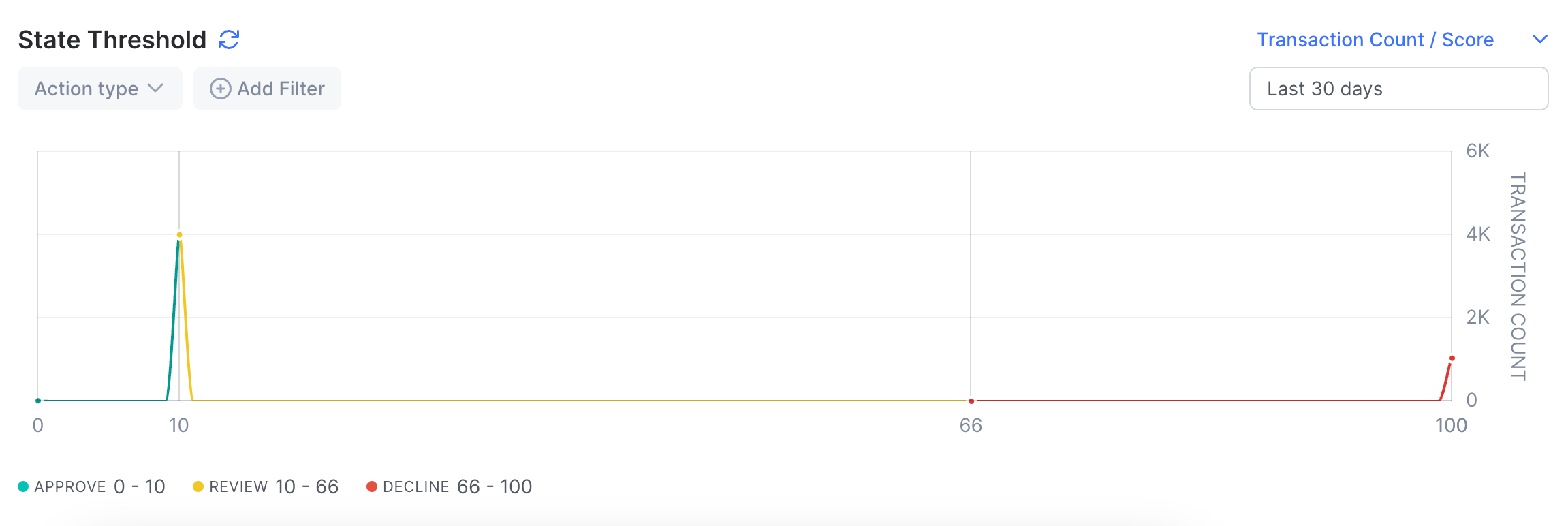
State threshold
The State threshold graph shows the frequency of transactions and their related fraud scores. The X-axis represents the transaction scores (from 0 to 100) and the Y-axis represents the total number of transactions with each score as well as the average transaction amount.
The graph can be filtered to either show transactions for the past year, past 30 days, or past week.
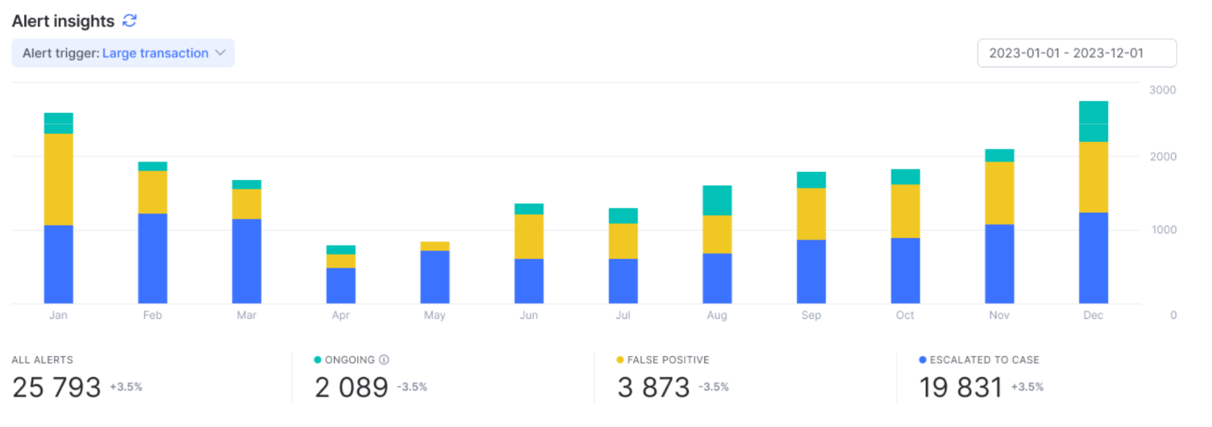
Alert insights
This chart shows the total number of alerts within a selected timeframe, categorized as ongoing across all active statuses, marked as false positive or escalated to a case. You can filter alerts by specific alert triggers and adjust the timeframe as needed.
Top toolbar
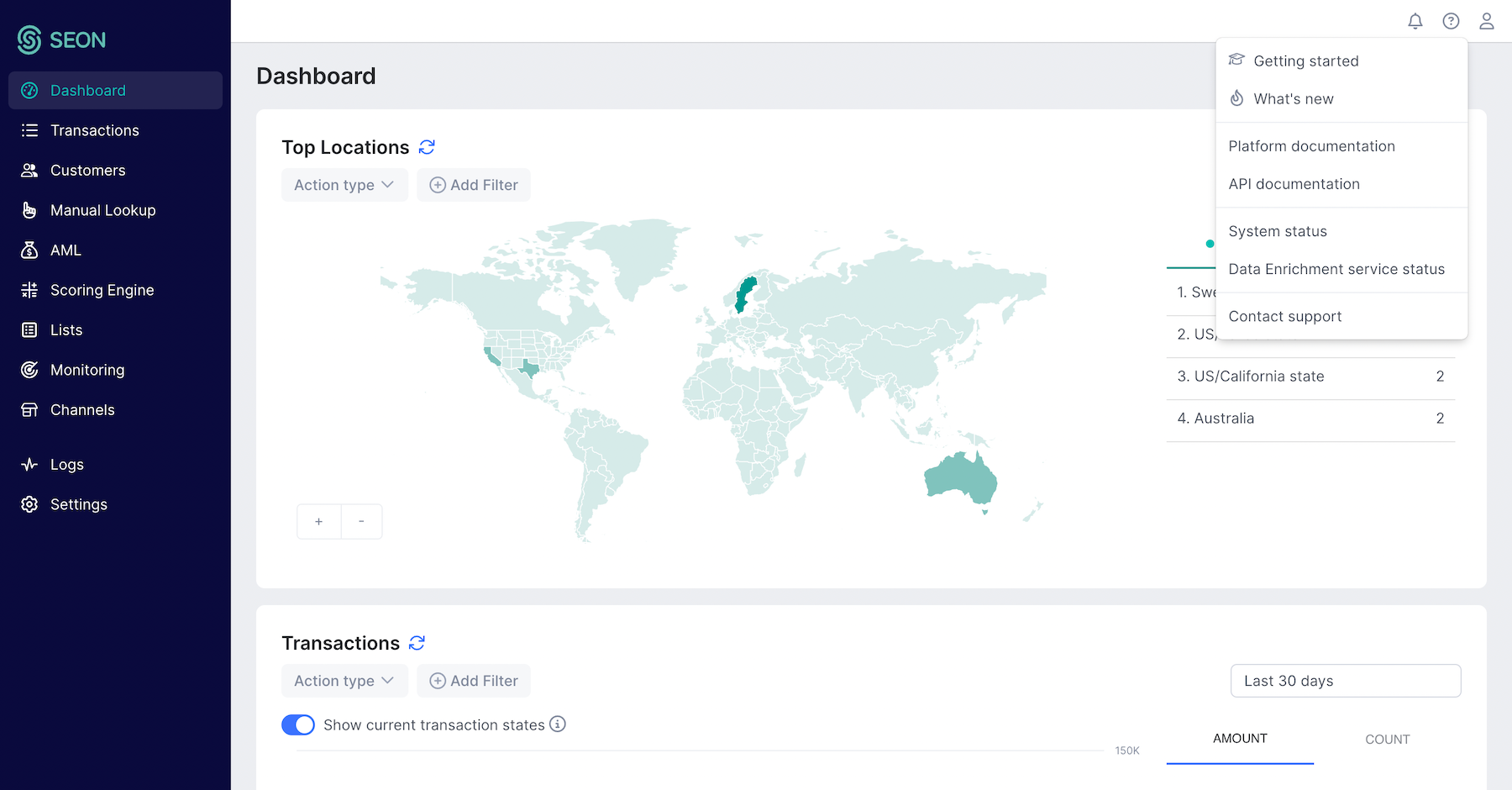
The top right corner of the Admin panel is your personalized SEON hub. Access your personal and organization settings or the Sandbox environment, product walkthroughs and news, and notifications from here.